观乎人文,内外相和
Humanities with Harmony
加斯东·巴什拉《空间的诗学》一书中写道:“空间并非填充物体的容器,而是人类意识的居所,建筑学就是栖居的诗学。”行云流水的设计手法修饰幻化空间意像传达,游走在城市的钢筋丛林中,置身其中,光影浮动,可观、可相和。
Gaston Bachelard said in the Poetics of Space that ‘Space is not a container for filling objects, but the residence of human consciousness, and architecture is the poetics of residence.’ The design technique expresses the spatial image. Walk in the city, you will see the light and shadow floating with harmonious.
缘起
Origin
“览相观于四极兮,一元和气归中正”
‘To earth's extremities we sought, and urged all with harmony.’
沿着长安街往东,数栋摩天大楼矗立于此,正大中心便坐落于北京CBD核心的“金十字”当中,北接光华路,西邻中国尊,俯瞰央视大楼,由两栋238米高的双子塔组成,配以裙楼屋顶花园,作为超甲级智慧型商业写字楼综合体,以自身场域更新城市界面。
Along Chang'an Street to the East, several skyscrapers stand here. Zhengda Center is located in the "golden cross" in the core of Beijing CBD. It is connected to Guanghua Road in the north and CITIC Tower in the West. Overlooking the CCTV building, it is composed of two 238 meter high twin towers. As an intelligent commercial office building complex, it updates the urban interface.
本案坐落于于北京正大中心,因所处地域及行业特性,客户希望打破传统边界,构建开放兼容的办公环境。共生和域设计事务所取义自然道法,融合城市多元开放精神,从观、和、光三重空间隐喻出发,以初启、置室、寻迹、抒怀、归家各空间篇章铺陈,打造现实办公场所的纪实叙事 ——“游记五部曲”。
This project is located in Beijing Zhengda Center. Due to the geographical and industrial characteristics, the customer hopes to break the traditional boundary and build an open and compatible office environment. Gongsheng Heyu Design takes the meaning of natural Taoism, and integrates the diversified and open spirit of the city. It starts from the triple space metaphor of view, harmony and light, and lays out five space chapters of Entering, Fade in, Tracing, Feeling and Home, so as to create a documentary narrative of office places - ‘five episodes of travel notes’.
01 初启/ Entering
仿从
佛口
若入
有
光
Entering from the entrance, it seems that light can be seen
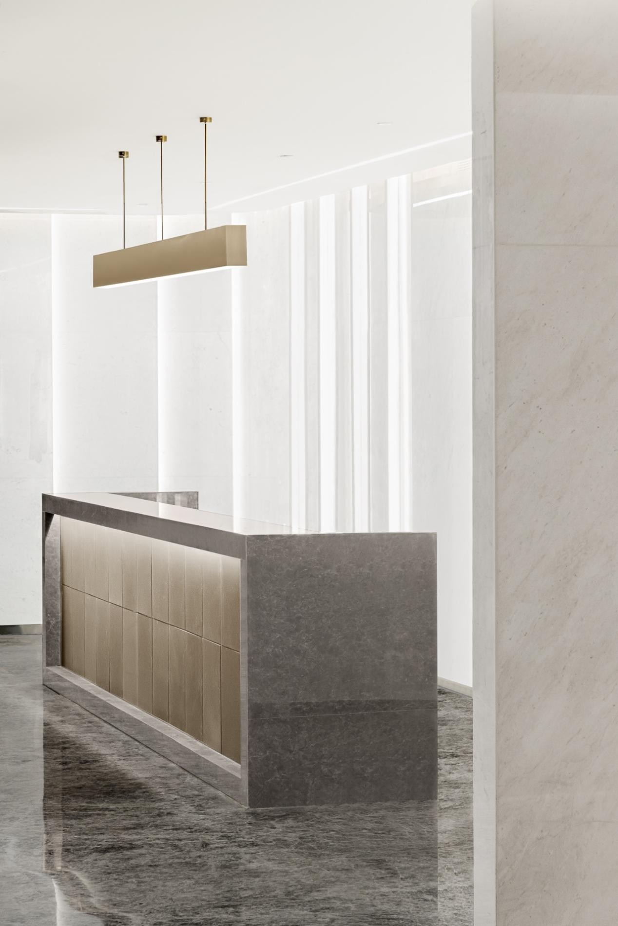
未来主义倒逼办公空间运动变革的背景下,美学功能、场景业态、设计语境、在地性表达等多重因素驱动更迭。设计师以「观」作为空间隐喻的第一重表达,以察观空间洞悉人文之意,通过运用不同材质与氛围光营造出另一个自由维度的精神世界。
Under the background of futurism forcing the change of office space movement, multiple factors such as aesthetic function, scene format, design context and local expression drive the change. Designers take ‘view’ as the first expression of spatial metaphor to observe space, gain insight into the meaning of humanities, and create another free dimension spiritual world by using different materials and light.
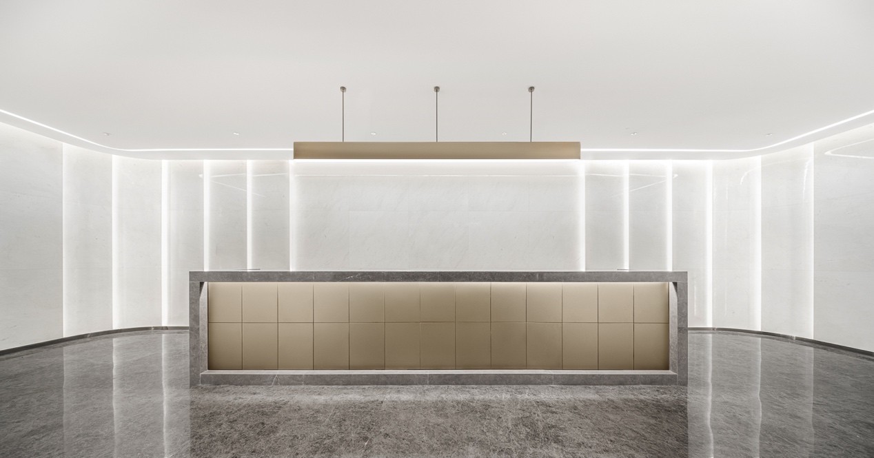
接待前厅将石材、金属等材料拼接联结,不同体块穿插之下虚实相生,为来访者构筑浑然一体的艺术幻境。中轴线作为北京历史文化的传承,《周礼·考工记》亦有记载:“惟王建国,方九里,旁三门,国中九经九纬,经涂九轨,左视右社,前朝后市”,设计师循迹古法,以周正方形由中心向四阖扩散,秩序工整,营造廓落空灵之感。
Stone, metal and other materials are spliced and connected in the reception lobby to build an artistic illusion for visitors. As the inheritance of Beijing's history and culture, the central axis is also recorded in the book of Zhou Li · Kaogong Ji. It said that when the architect built the capital city, the city plane was square, the side was nine Li long, and there were three gates (two side gates) on each side. There are eighteen streets with nine vertical and nine horizontal directions in the city. The street is wide enough to drive nine carriages (72 feet) at the same time. On the left (East) of the palace is the ancestral temple, and on the right (West) is the social hall. In front of the palace is the place where officials worship, and behind it is the market. Each side of the market and worship place is 100 steps (a square with a side length of 100 steps). The designer followed the ancient method to spread the square from the center to around orderly, creating a sense of emptiness.
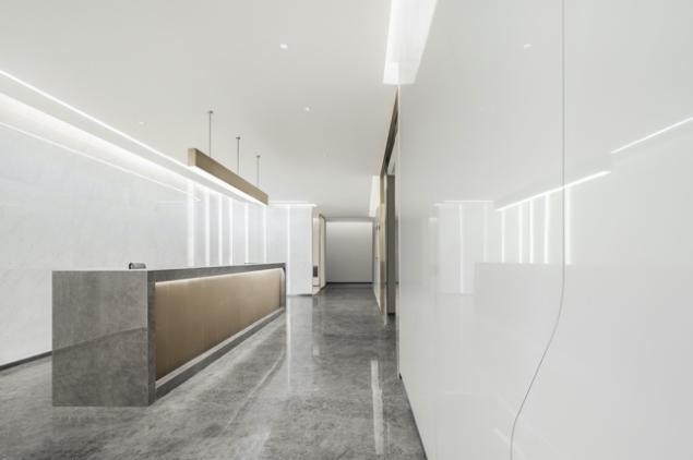
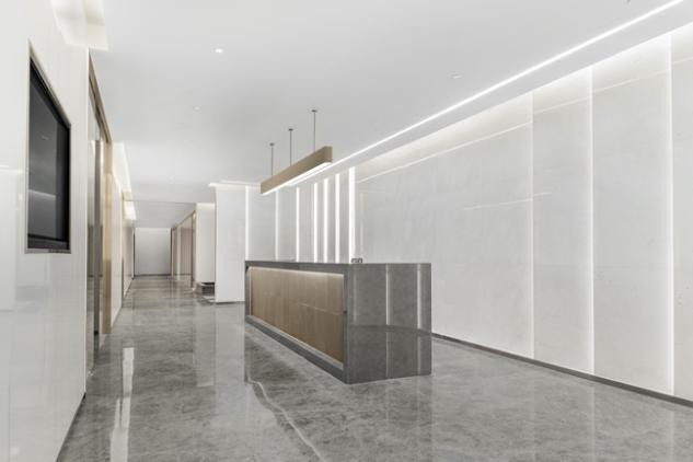
光影是统一局部的有效方法,形式、材料、细节皆是可修饰的手法,却往往没有光来得那么直接。设计师以灯光切片的形式让空间流动起来,同时化体为面的手法适当地削弱了建筑体量造成的压迫感,在空间真正登场前营造了一场关于光的准备仪式。
Light and shadow is an effective way to unify parts. Forms, materials and details are modifiable techniques, but they are not as direct as light. The designer made the space flow in the form of light slices. At the same time, the method of turning the blocks into the surface appropriately weakened the sense of oppression caused by the building volume, and created a preparation ceremony about light before the appearance of the space.
02置室/ Fade in
豁躬
然行
开数
朗十
步
Walking dozens of steps inside, I feel suddenly enlightened
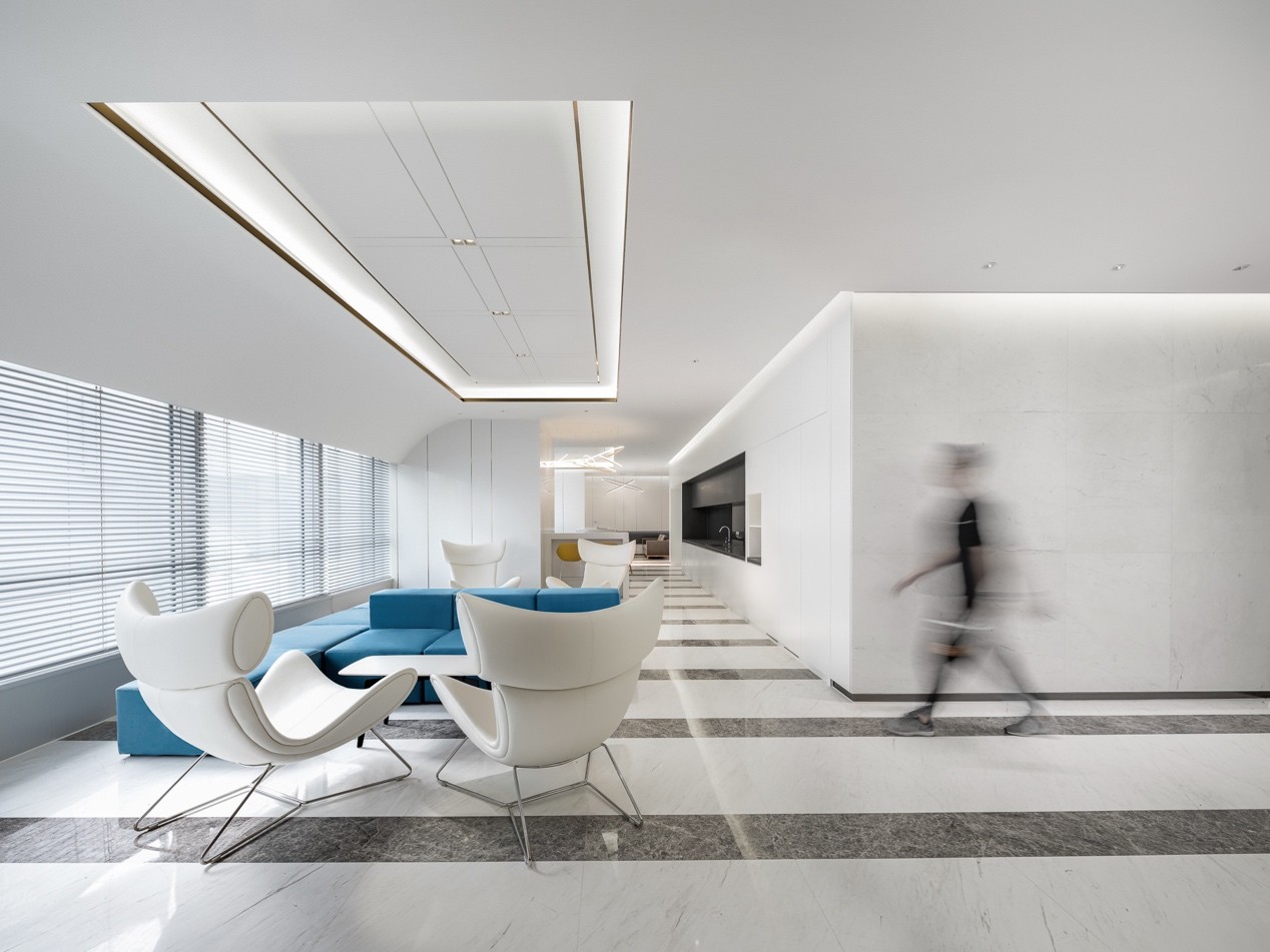
穿过前厅,进入主体空间,「光」是设计师作为空间隐喻的第二重表达。正如路易斯·康所说:“太阳永远不知道它有多大,直到它撞到一座建筑的侧面。”光的存在,移情自然,模糊并消隐空间的本来“面貌”,为来者提供了诗意的想象。
Walk into the main space through the front hall, "light" is seen as the second expression of the designer as a spatial metaphor. As Louis Kang said, ‘the sun never knows how big it is until it hits the side of a building.’ The existence of light blurs and hides the original ‘face’ of space, which provides poetic imagination for the coming.
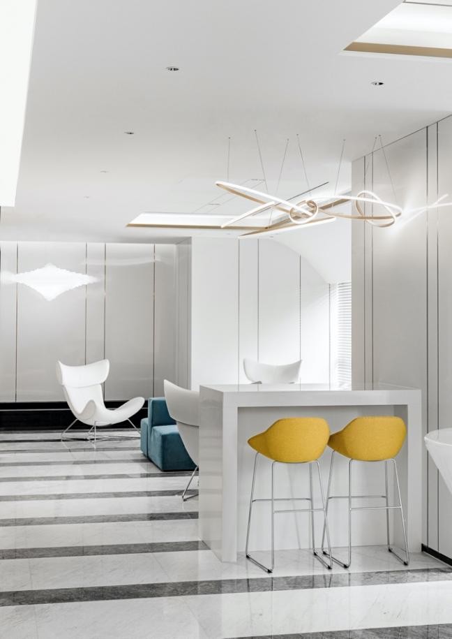
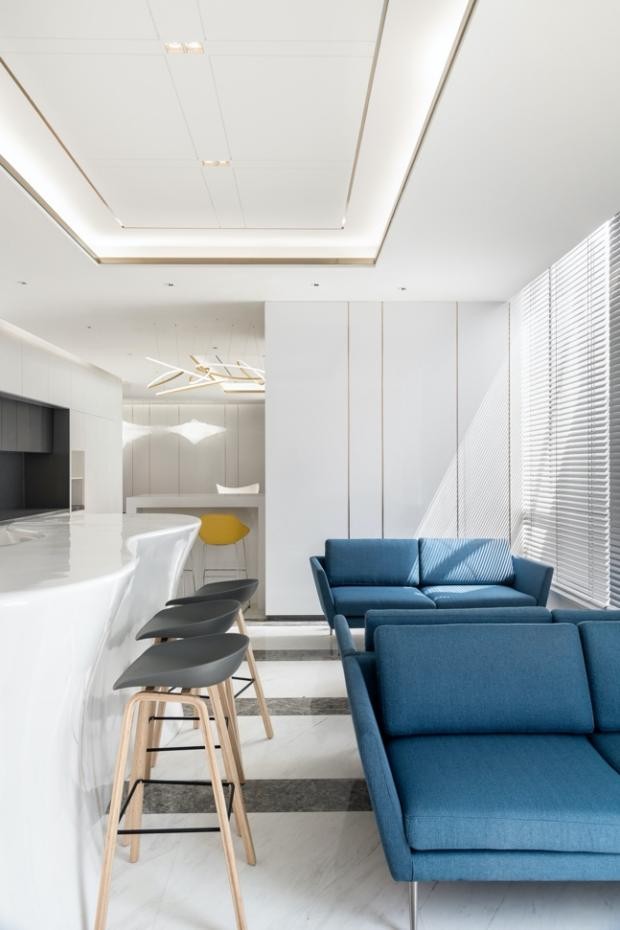
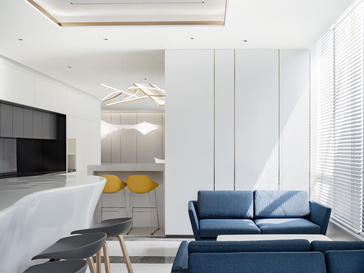
白色是将光与影的展示效果达到最大化的最好参照,设计师运用大量留白的手法表达更深层次的空间情绪,以光线为叙事切入点,通过不同尺度的高低、纵深、明暗、起伏、虚实、进退的视觉间隔变化,赋予休闲区不断被“阅读”的更多可能性。
White is the best reference to maximize the display effect of light and shadow. The designer uses blank-leaving to express deeper spatial emotions, and takes light as the narrative entry point. The leisure area with more possibilities can be ‘read’ through the visual interval changes of different scales, such as height, depth, light and shade, ups and downs, virtual and real, advance and retreat.
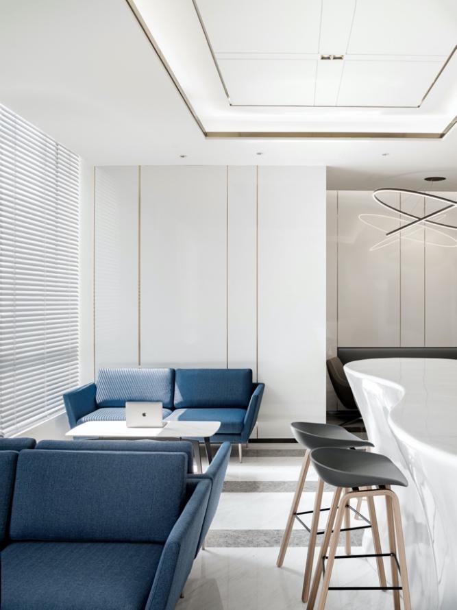
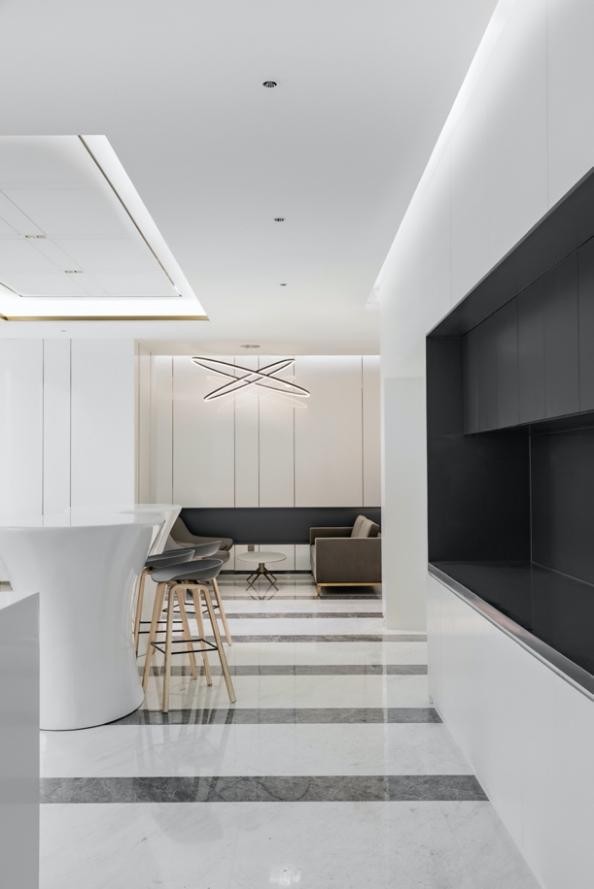
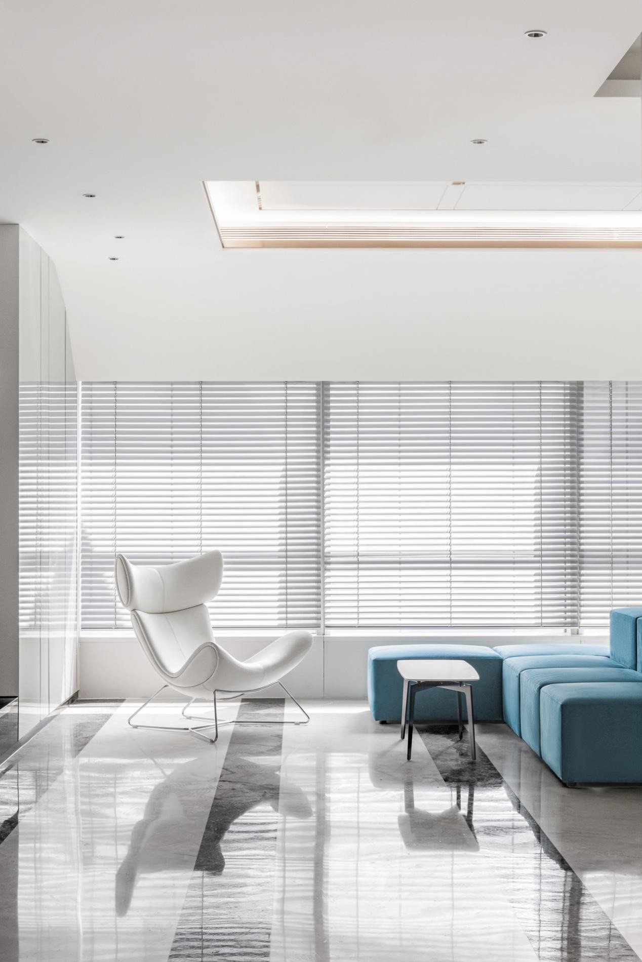
现代主义的自我和个性表达亦在空间中得以舒展:轻奢吊灯与大理石地面遥相呼应,橙蓝暖色调软装让静谧的休憩环境增添了份鲜明活力,阳光透过百叶窗折射照进屋内,在“隔断”与“连续”的虚实相间中肆意洒落,光影婆娑,各元素游走其中、和而不同。
Modernist self and personality expression can be extended in the space. Light luxury chandeliers echo with the marble floor. Orange and blue warm color soft decoration add a distinct vitality to the quiet rest environment. The sunlight refracts into the house through the shutters while the light and shadow whirl. Various elements are different but harmonious.
03寻迹/ Tracing
有屋
休舍
憩俨
之然
属一
The space is neat and there is a place to rest.
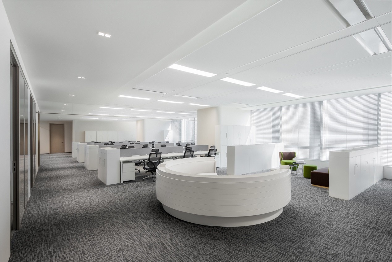
不同于前场片区的空灵,工作区加强了归属感,「和」是设计师作为空间隐喻的第三重表达。和而不同的人文精神作为整个项目的设计内核贯穿其中,办公空间的规划逻辑不再受到传统的以办公区域功能或部门划分的限制,空间在个性化的背景中得以重构、不断进化。
Different from the ethereal of the front area, the work area strengthens the sense of belonging. ‘Harmony’ is the third expression of the designer as a spatial metaphor. As the design core of the whole project, the spirit of harmony and diversity runs through it. The planning logic of office space is no longer limited by the traditional division of office area functions or departments, and the space can be reconstructed and continuously evolved in the personalized background.
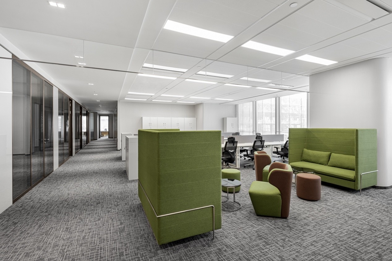
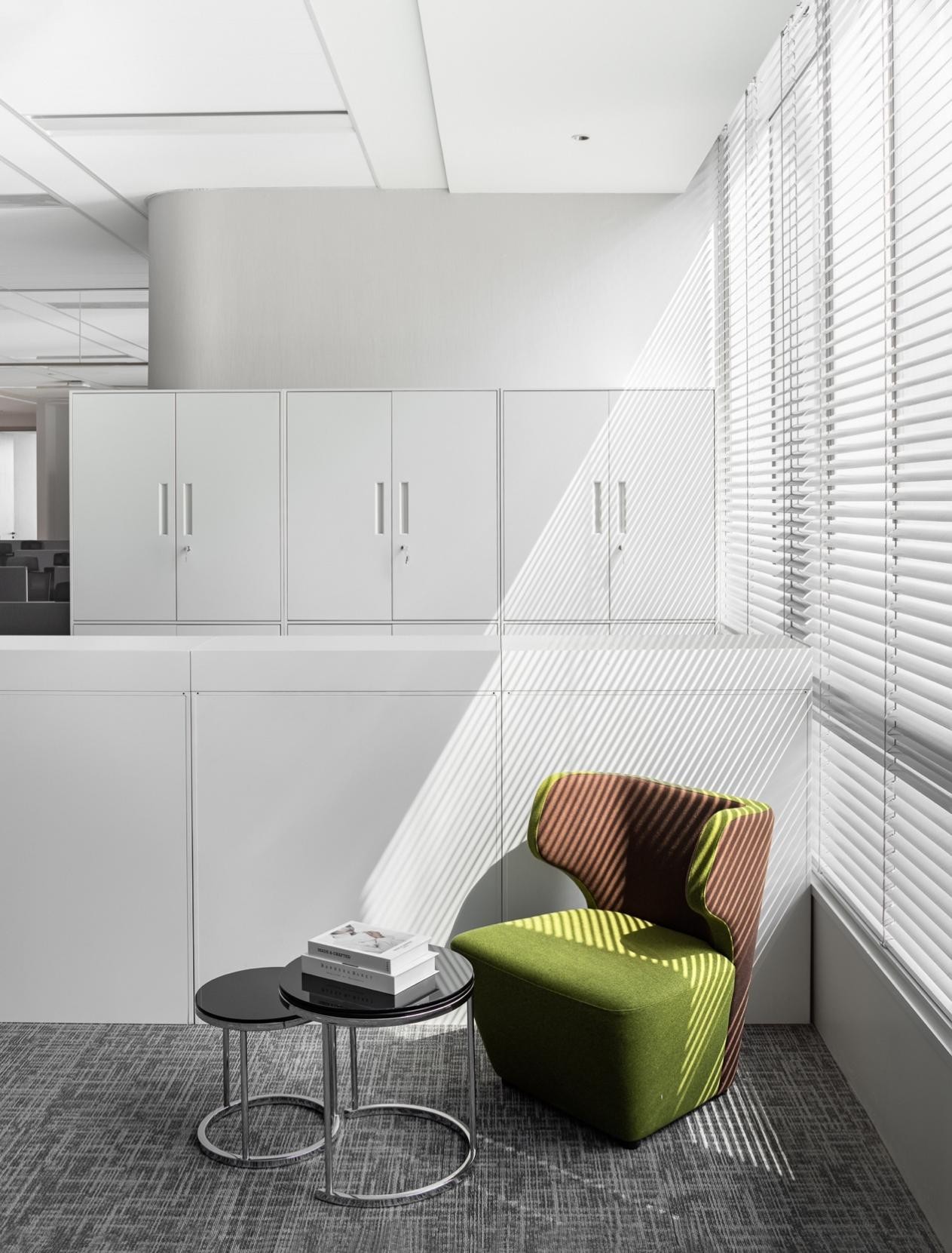
随着时代的飞速发展工作模式亦随之改变,具有包容性与灵活多样性的环境空间变得更容易接纳。以人的活动为导向进行规划,设计师从工作场所与居家舒适感相和的空间命题出发,以办公工位与休闲区为核心,消弭场域边界,与其他功能分区构成环形动线。可移动、多功能、轻量化、符合人体工学的家具可瞬间实现自由转换,为未来工位变化创造便利条件。
With the rapid development of the times, the working mode has changed, and the environmental space with inclusiveness, flexibility and diversity has become easier to accept. Guided by human activities, the designer starts from the space proposition of the harmony between workplace and home comfort, with the core of office station and leisure area, eliminating the field boundary, and forms a circular moving line with other functional zones. Movable, multifunctional, lightweight and ergonomic furniture can realize free conversion instantly, creating convenient conditions for future station changes.
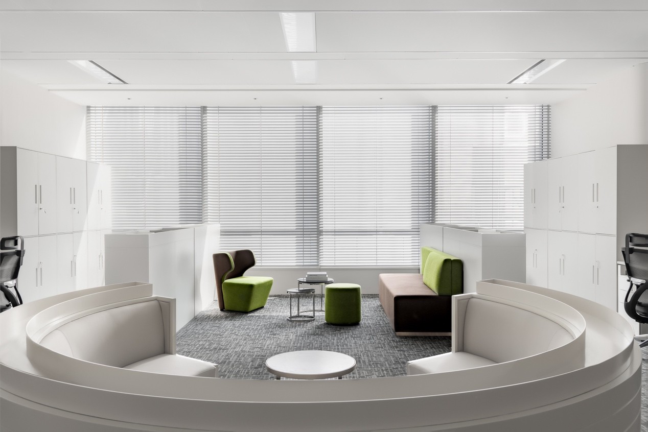
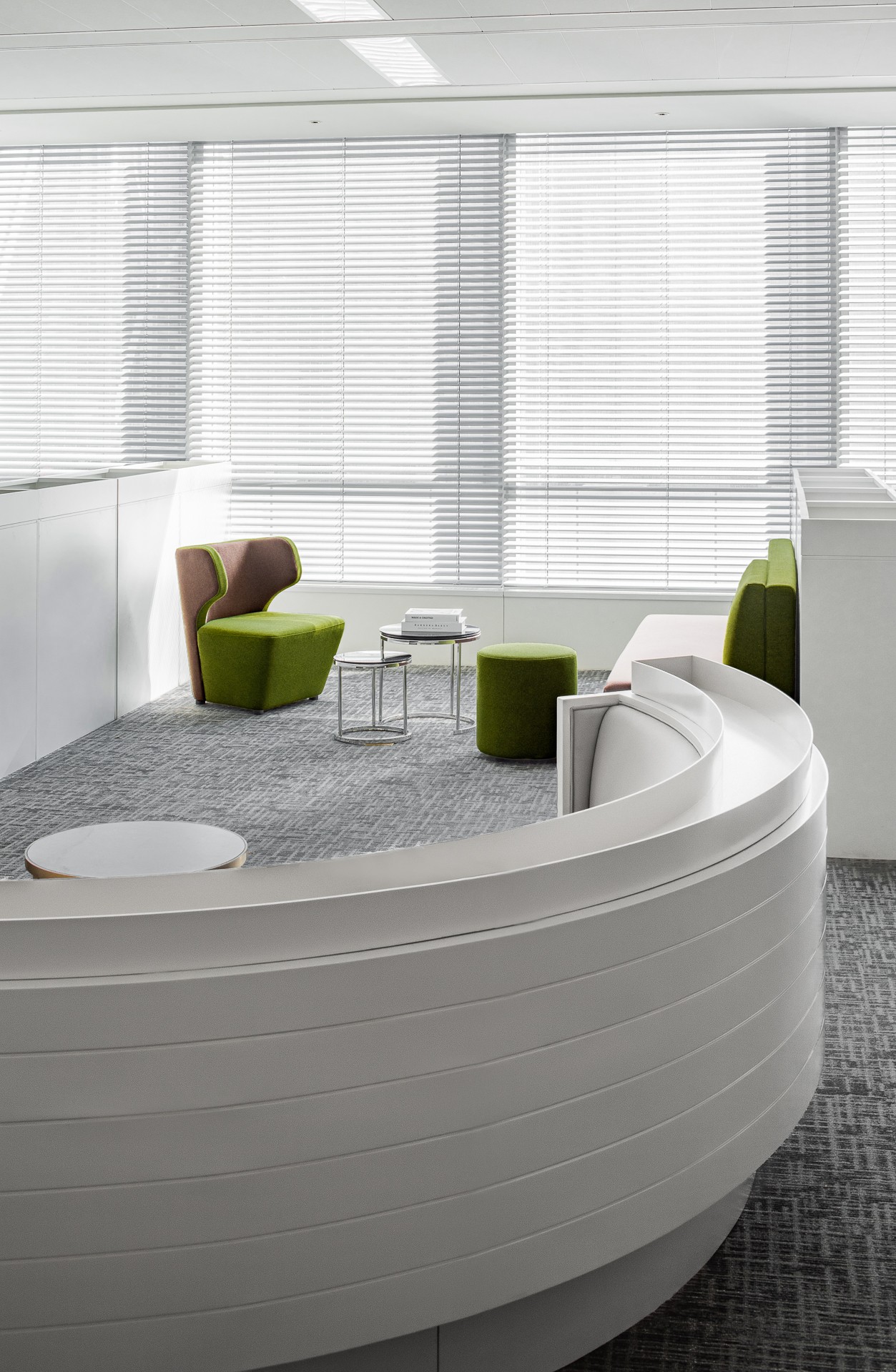
移步换景,半环状休闲讨论区增加人与人之间互动交流的机会,形状各异的绿色沙发座椅吸纳自然相映成趣,大面积立体柜打造收纳空间,纯净的白色与空旷空间没有任何多余的装饰,带给人通透干净的视觉体验,分区之间风格融合却又相互独立。
The semi-circular leisure discussion area increases the opportunities for interaction and communication between people. The green sofa seats with different shapes absorb nature elements. The large-area-cabinets create storage spaces. The pure white and open space have no redundant decoration, which brings people a transparent and clean visual experience. The styles between the partitions are integrated but independent of each other.
04抒怀/ Feeling
私其
密中
有往
间来
交
流
There are private exchanges.
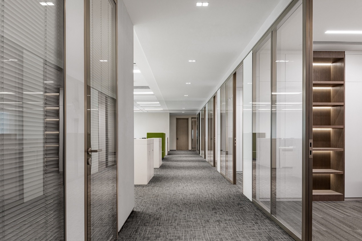
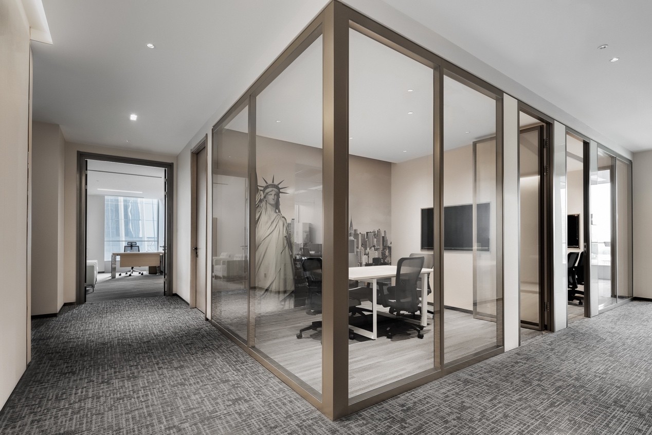
透明玻璃盒子,对话联结
Transparent glass boxes with dialogues
穿屏而过,便介置于独立会议室区域。灵活的金属镶边玻璃门泾渭分明,隔开室内与室外的联结对话,仿佛是漂浮于岛屿的透明玻璃盒子,又似丛林之中的私密小屋。空间上设计师亦做了递进的处理,让每一扇门都与过道相望,给人以包容与衔接的丰富层次之感。
Through the screen, a separate conference room appeared. The flexible metal rimmed glass door separates the connection and dialogue between indoor and outdoor. It is like a transparent glass box floating on an island or a private cabin in the jungle. In terms of space, the designer has also made progressive treatment, so that each door faces the aisle, giving people a sense of tolerance and connection.
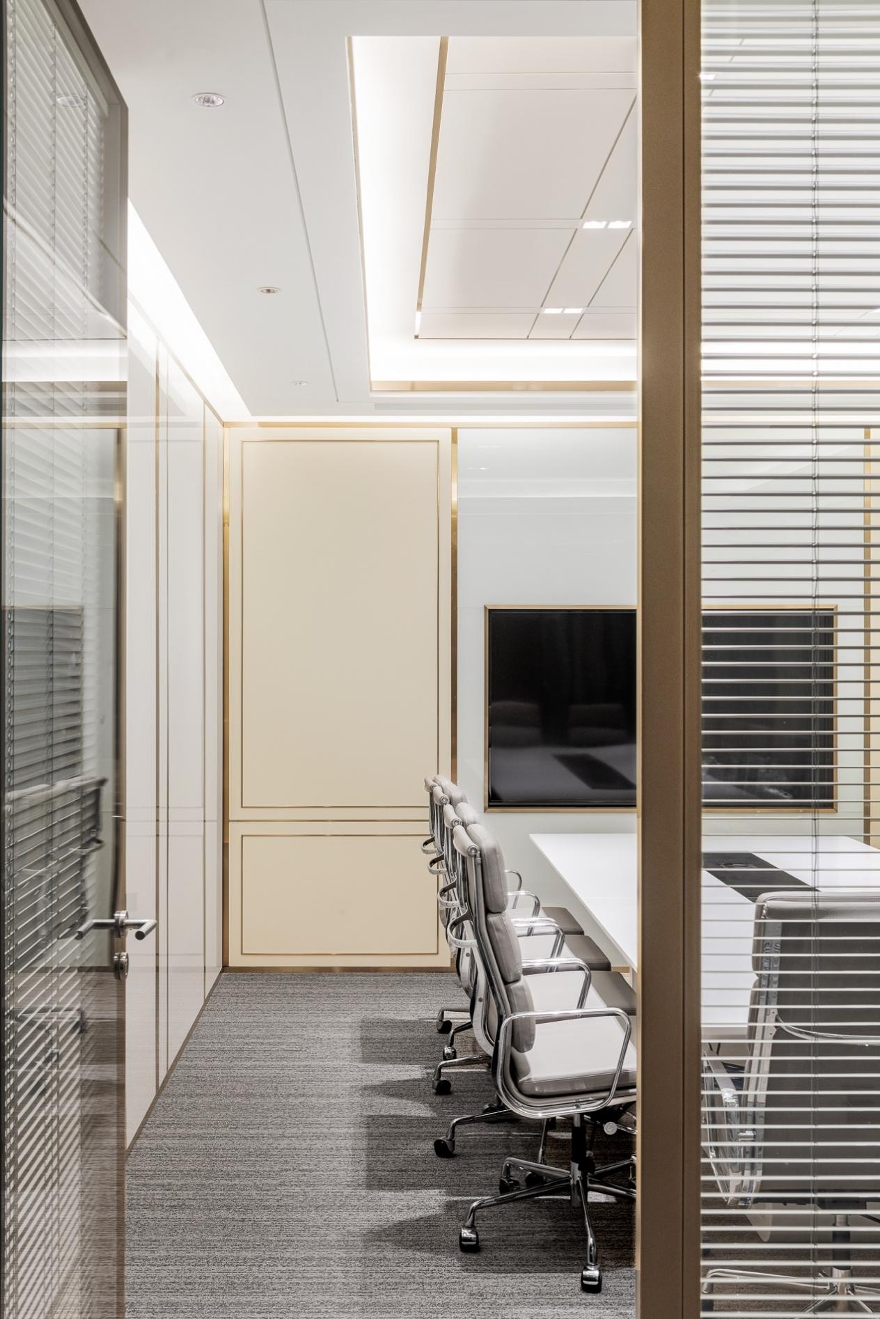
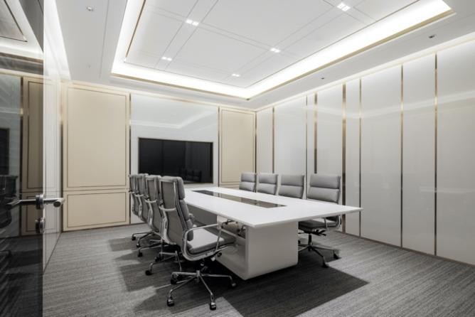
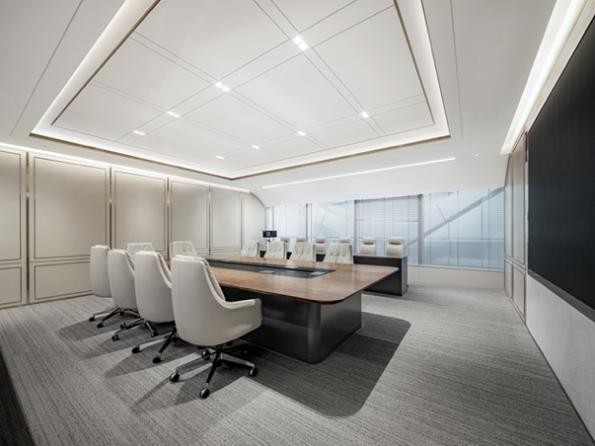
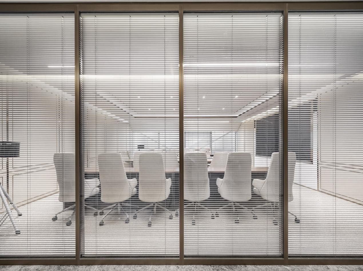
设计前期设计师通过调研了解员工实际需求与会议场景,科学配备大中小会议室类型可满足各种使用需求。整体沿用场外标志性流线型设计元素,形成视觉延续。灰色编织地毯营造高雅格调与舒适体验,现代办公桌椅符合人体工学,金属格栅则强调了空间整体的私密性。
In the early stage of design, the designer knew the actual needs of employees and meeting scenes through investigation, and scientifically equipped with large, medium and small meeting rooms to meet various use needs. The overall use of off-site iconic streamlined design elements to form a visual continuation. Gray woven carpet creates elegant style and comfortable experience, modern office tables and chairs comply with ergonomics, and metal grille emphasizes the overall privacy of the space.
05归家/ Home
并居
怡室
然如
自归
得交
Feel at home with comfort.
城市会客厅,归家礼序
City reception room with belonging
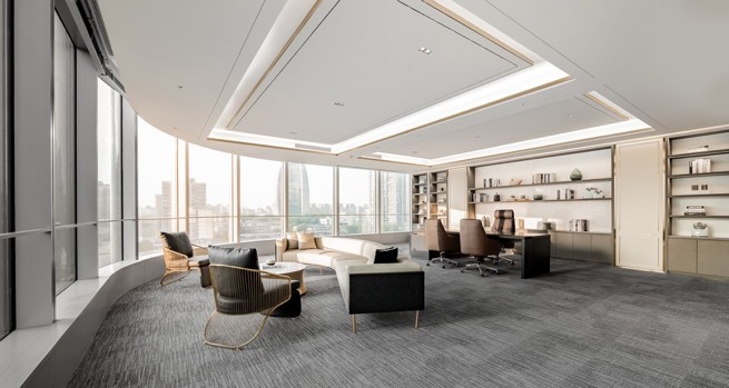
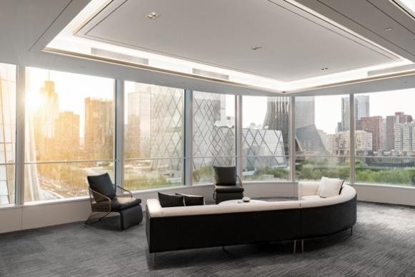
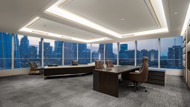
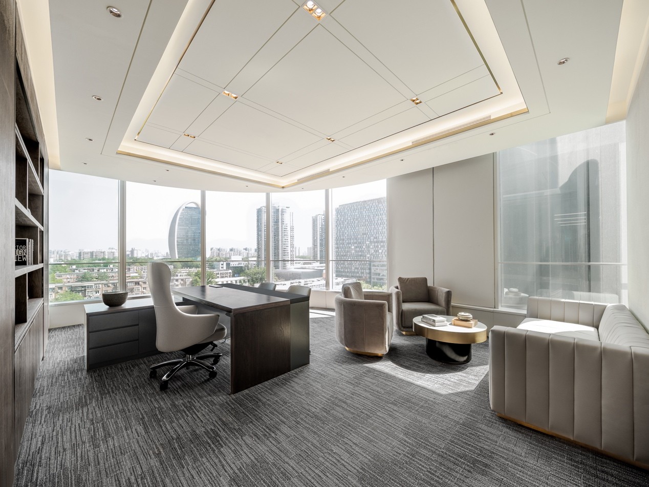
整个项目就像一座桥梁,隐于北京文化的肌理之中,也衔接起当代的都市视野。领导办公室作为空间交互的中心,偌大的落地玻璃幕墙俯瞰一天中光影变换,室外匆忙的人流昼夜穿梭于城市核心的财富坐标,室内工作休憩,会客洽谈,谈吐间呼吸吐纳,恍若跟随城市脉搏起伏的节奏,与时代融为一体。
The whole project is like a bridge, hidden in the texture of Beijing culture and connecting the contemporary urban vision. As the center of space interaction, the leadership office has a huge floor glass curtain wall overlooking the transformation of light and shadow during the day, and the rush of people outside shuttles around the wealth coordinates of the city core day and night. It seems to follow the rhythm of the city's pulse and integrate with the times by working and resting indoors, meeting guests and negotiating in conversation.
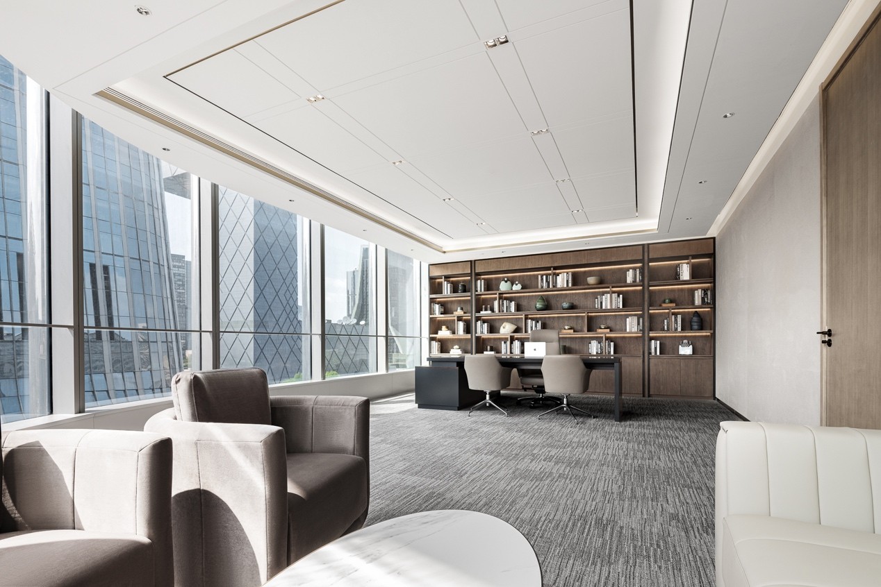
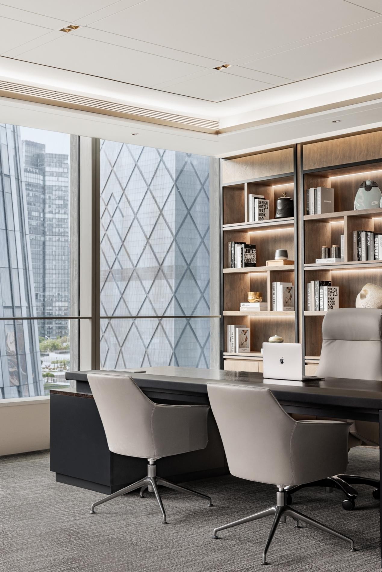
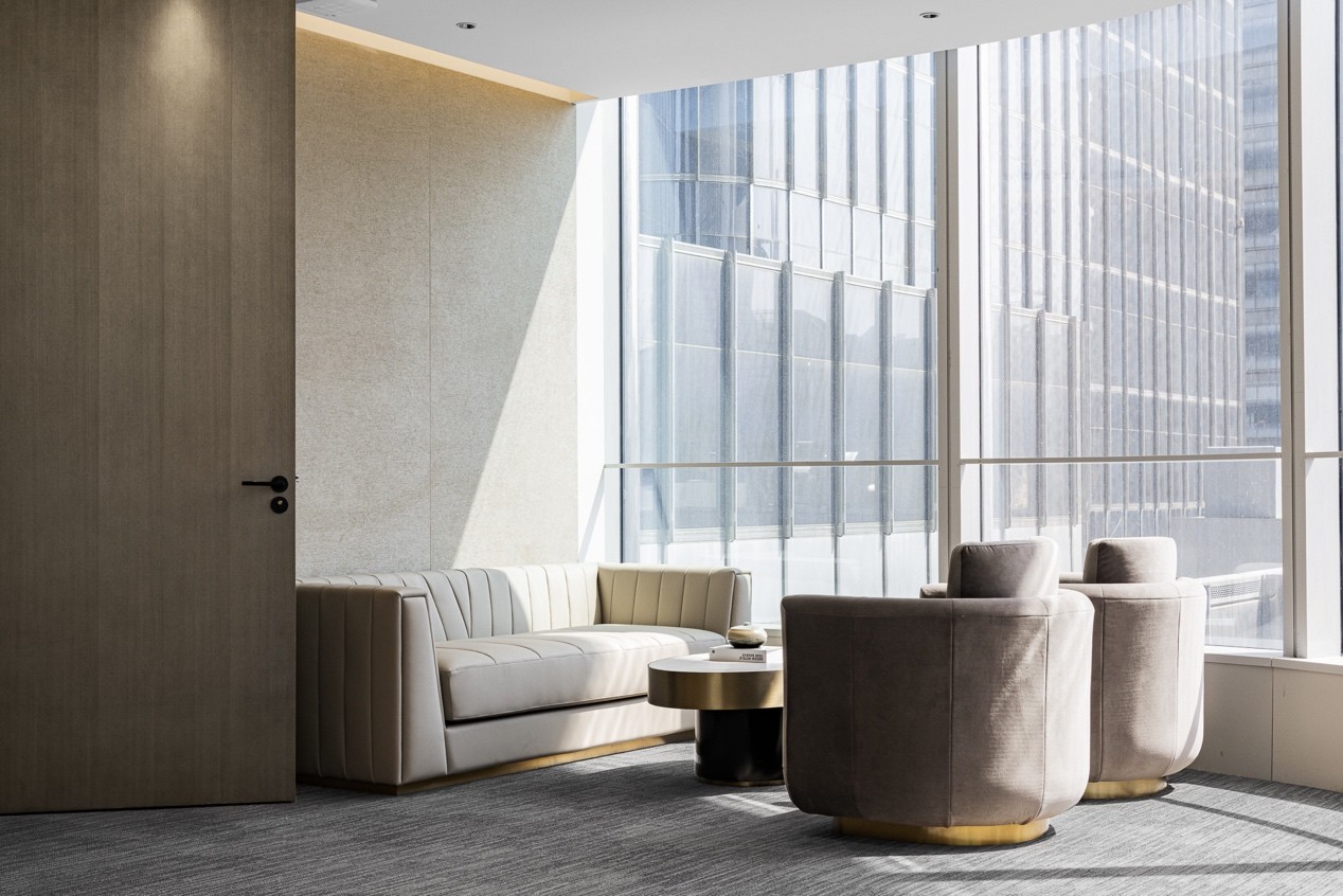
流畅的线条与体块统筹皮革、金属与胡桃木的材质拼接,低调稳重的布艺沙发,浅灰色的视觉基调营造温润大气的空间基调。珍藏的艺术展示装置与书籍陈列其中,仿佛私人府邸的专属空间,而不刻意、恰到好处的摆放恰是设计师匠心独特的艺术创作。
Smooth lines are stitched with leather, metal and walnut materials. The low-key and steady cloth sofa and light gray visual tone create a warm space. The collection of art devices and books are displayed like they are in the exclusive space of a private residence. The proper placement is the designer's unique artistic creation.
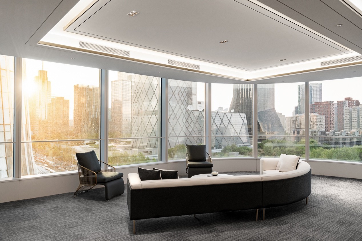

舒尔兹曾说场所是具有清晰特性的空间,“有观乎于人文、个性,兼顾道法自然与城市精神;有光影婆娑渐入佳境的诗意想象;有自由维度下的包容表达,”娓娓道来、叙述完毕的正大办公空间,相信将会成为北京的另一文化新地标。
Schultz once said that place is a space with clear characteristics, ‘it is based on humanity and personality, taking into account Taoism, nature and urban spirit. There is a poetic imagination of light and shadow whirling with inclusive expression in the dimension of freedom.’ Zhengda office space will become another new cultural landmark in Beijing.
项目名称:正大侨商
Project Name: Zhengda Qiaoshang
设计单位:共生和域
Design Company: H&Y DESIGN
设计总监:刘浩宇
Design Director: Kevin Liu
项目地点:北京
Project Location: Beijing
设计面积:2000平米
Design Area: 2,000 Square Meters
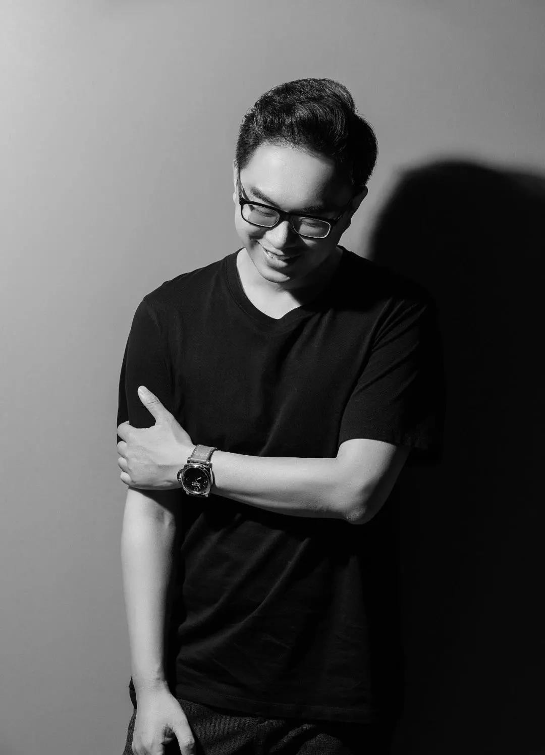
刘浩宇 Kevin
共生和域品牌 创始人
十口田品牌 联合创始人
刘浩宇长期以来一直专注于室内空间设计行业,认为设计是时间,空间与需求的综合表达,是体验感知营造的艺术表达。设计无界限,每个人对空间都应有各自的理解和体会,希望通过设计将艺术、科学、技术相互融合、贯穿始终,构建感知的桥梁,让空间富有生命;希望通过理性逻辑挖掘需求本质,构建具有思维意识的时代性场景空间。
曾获奖项
2015年获中国室内设计金堂奖优秀设计奖。
2019年度亚太空间设计大赛金奖
2019年度荣获中国国际设计艺术博览会 “华鼎奖”一等
2020年获中国寻星奖第二季全国总冠军
2021年金外滩奖金奖
本案坐落于于北京正大中心,因所处地域及行业特性,客户希望打破传统边界,构建开放兼容的办公环境。共生和域设计事务所取义自然道法,融合城市多元开放精神,从观、和、光三重空间隐喻出发,以初启、置室、寻迹、抒怀、归家各空间篇章铺陈,打造现实办公场所的纪实叙事 ——“游记五部曲”。
This project is located in Beijing Zhengda Center. Due to the geographical and industrial characteristics, the customer hopes to break the traditional boundary and build an open and compatible office environment. Gongsheng Heyu Design takes the meaning of natural Taoism, and integrates the diversified and open spirit of the city. It starts from the triple space metaphor of view, harmony and light, and lays out five space chapters of Entering, Fade in, Tracing, Feeling and Home, so as to create a documentary narrative of office places - ‘five episodes of travel notes’.
接待前厅将石材、金属等材料拼接联结,不同体块穿插之下虚实相生,为来访者构筑浑然一体的艺术幻境。中轴线作为北京历史文化的传承,《周礼·考工记》亦有记载:“惟王建国,方九里,旁三门,国中九经九纬,经涂九轨,左视右社,前朝后市”,设计师循迹古法,以周正方形由中心向四阖扩散,秩序工整,营造廓落空灵之感。Stone, metal and other materials are spliced and connected in the reception lobby to build an artistic illusion for visitors. As the inheritance of Beijing's history and culture, the central axis is also recorded in the book of Zhou Li · Kaogong Ji. It said that when the architect built the capital city, the city plane was square, the side was nine Li long, and there were three gates (two side gates) on each side. There are eighteen streets with nine vertical and nine horizontal directions in the city. The street is wide enough to drive nine carriages (72 feet) at the same time. On the left (East) of the palace is the ancestral temple, and on the right (West) is the social hall. In front of the palace is the place where officials worship, and behind it is the market. Each side of the market and worship place is 100 steps (a square with a side length of 100 steps). The designer followed the ancient method to spread the square from the center to around orderly, creating a sense of emptiness.穿过前厅,进入主体空间,「光」是设计师作为空间隐喻的第二重表达。正如路易斯·康所说:“太阳永远不知道它有多大,直到它撞到一座建筑的侧面。”光的存在,移情自然,模糊并消隐空间的本来“面貌”,为来者提供了诗意的想象。Walk into the main space through the front hall, "light" is seen as the second expression of the designer as a spatial metaphor. As Louis Kang said, ‘the sun never knows how big it is until it hits the side of a building.’ The existence of light blurs and hides the original ‘face’ of space, which provides poetic imagination for the coming.不同于前场片区的空灵,工作区加强了归属感,「和」是设计师作为空间隐喻的第三重表达。和而不同的人文精神作为整个项目的设计内核贯穿其中,办公空间的规划逻辑不再受到传统的以办公区域功能或部门划分的限制,空间在个性化的背景中得以重构、不断进化。Different from the ethereal of the front area, the work area strengthens the sense of belonging. ‘Harmony’ is the third expression of the designer as a spatial metaphor. As the design core of the whole project, the spirit of harmony and diversity runs through it. The planning logic of office space is no longer limited by the traditional division of office area functions or departments, and the space can be reconstructed and continuously evolved in the personalized background.移步换景,半环状休闲讨论区增加人与人之间互动交流的机会,形状各异的绿色沙发座椅吸纳自然相映成趣,大面积立体柜打造收纳空间,纯净的白色与空旷空间没有任何多余的装饰,带给人通透干净的视觉体验,分区之间风格融合却又相互独立。The semi-circular leisure discussion area increases the opportunities for interaction and communication between people. The green sofa seats with different shapes absorb nature elements. The large-area-cabinets create storage spaces. The pure white and open space have no redundant decoration, which brings people a transparent and clean visual experience. The styles between the partitions are integrated but independent of each other.整个项目就像一座桥梁,隐于北京文化的肌理之中,也衔接起当代的都市视野。领导办公室作为空间交互的中心,偌大的落地玻璃幕墙俯瞰一天中光影变换,室外匆忙的人流昼夜穿梭于城市核心的财富坐标,室内工作休憩,会客洽谈,谈吐间呼吸吐纳,恍若跟随城市脉搏起伏的节奏,与时代融为一体。
The whole project is like a bridge, hidden in the texture of Beijing culture and connecting the contemporary urban vision. As the center of space interaction, the leadership office has a huge floor glass curtain wall overlooking the transformation of light and shadow during the day, and the rush of people outside shuttles around the wealth coordinates of the city core day and night. It seems to follow the rhythm of the city's pulse and integrate with the times by working and resting indoors, meeting guests and negotiating in conversation.

为爱而聚,好梦有你 丨 Simmons席梦思举办“爱在一起”客户答谢会
每个人都有自己的心中热爱,它可以是可爱的宠物、充满意义的工作、热血的运...时间:2023-05-19
电视出货量上半年创五年新高,下半年大概率急转直下
8月24日,TrendForce集邦咨询发布的报告显示,2021年上半...时间:2021-08-30
重押新品类、围绕“静音”新场景,京东家电打造厨电营销新逻辑
8月26日,由中国家用电器协会指导,中国家电网主办的2021中国厨电行...时间:2021-08-30
舒舒服服睡好觉,试试澳柯玛“零风感”空调
立秋过了,三伏天也快结束,但是秋老虎还没有走。一边感受着八月正午的阳光...时间:2021-08-30
互联网家装解决不了痛点 与传统家装无区别
近期,几大互联网家装品牌接连曝出装修质量问题,引起业内人士和消费者的关...时间:2021-08-30